Oracle Logo Amazon Web Services

Building AWS Config

AWS Config was the first product in a new line of AWS cloud computing tools designed to assess, audit, and evaluate the configurations of your AWS resources.

The four month sprint to launch AWS Config

Based on a series of interviews and user surveys with AWS customers, there was a strong demand for a monitoring and evaluation service that continuously tracks AWS resource configurations and automates the assessment of these configurations against desired standards.

My goal for this project was to design the entire new AWS Config console from beginning to end prior to its release during reInvent.

The following content shows some of the qualitative data obtained during the interviews regarding user's needs.

  • AWS customers wish to have a tool that discovers AWS resources that exist within his account at any point in time.
  • Have a visual way to see how changes occurs in the pass.
  • Many customers had difficulty keeping track of and localizing resources changes over time when using AWS.
  • Be able to troubleshoot why a resource may have stopped working properly.

What is AWS Config again?

AWS Config (Amazon Web Services Config) is an Amazon cloud auditing tool that provides an inventory of existing resources, allowing an administrator to accurately track AWS assets to analyze compliance levels and security. It also enables an administrator to troubleshoot why a resource may have stopped working properly.

My role

  • CONDUCT RESEARCH. Research potential users to find out what their goals and needs are in order to determine product value.
  • COLLABORATE ACROSS DISCIPLINES. Leading - 1 hour Design Studio. This workshop gathers various team members into a room to sketch solutions around a single focused scenario and a prioritized set of features. The goal is to uncover use cases, gather ideas, and provide insight to other team members to make planning smoother.
  • DELIVER DESIGN DECISIONS. Led the team through a thoughtful and meaningful process making incremental design decisions along the way. These decisions are delivered in many forms such as a conversation, sketch, whiteboard session, wireframe, detailed mockup, or a prototype.
  • SEEK FEEDBACK. I sought feedback from users and stakeholders constantly sharing my work with fellow design peers and gather feedback.
  • COMMUNICATE EARLY AND OFTEN. Being part of a Balanced and Agile team means I communicate with the team as a leader, facilitator, and educator. The team rely on me to lead how the product will act and look, facilitate conversations to gather feedback and educate the team on research findings.

Understanding the user

We began by exploring our assumptions about how potential users discover AWS resources that exist within an account at any point in time. For example, our first reaction was to provide a datepicker control to navigate in time to see changes of configuration. After speaking to our users we would end up finding a better approach.

Next, we wrote questions to prompt the interviewees to tell their story in their words. The intention was to get these people to tell us what was important to them when looking for configuration across different AWS resource types.

The first round of interviews produced a number of distinct clear trends.

  • A simple way to navigate in time to see changes.
  • Date picker was the wrong UI to look for dates.
  • Relationship between details about configurations of every resource and time.
  • Visuals will help users to have a clear view of changes.

Next, I created a provisional persona of a potential user based on PM knowledge and my understanding of the user. This persona was created with assumptions and not fully research-based but it was something that I came back to throughout my project to guide my design decisions and priorities.

"As a System Administrator I want to navigate in time to inventory resources that exist in my account, understand current and previous configurations for their resources and evaluate how a configuration change to one resource affects related AWS resources.”
sample3
Auric Goldfinger

What else has AWS tried?

It was challenging to design a tool for navigating in time to see changes without breaking some *UXDG patterns. The first unsuccessful attempt was to use only UXDG components.

Image shows the date picker control available in the UXDG library.

Feedback from users suggested investigating another way to allow customers to navigate through time in a more intuitive and aesthetical way.

The responses obtained from users after showing the previous mock stated that using a Date Picker control, to see changes of resources over time, was not the correct solution. Date Pickers consist of input controls where users enter data to obtain a result. The user feels like in an Easter Egg hunting trying to see changes. Contrary, we were looking for a control that helps users to visualize a series of changes over time without entering any input.


Design artifacts

Before I could jump into designing, it was important to define success and understand the requirements.

Due to the complexity of the system I was designing for, creating a task flow helped me represent the logic sequence of the user's flow from the starting point to accomplishing a task.

Task flow

I use Task Wireframes constantly during the early phase of prototyping because it helps to present the flow and interactions of the design without spending time developing an interactive prototype. Each task is explained so stakeholders can review and comment on the design. After the wireframe is approved then I start working on a high-fi prototype where developers can visualize and interact with the design.

My process involved sketching and white‐boarding concepts and flows with my PM partner and then translating these directly into hi‐fidelity design comps. Since I was working with many existing design patterns, it was relatively easy to move straight into hi‐fidelity designs.

“...how might we help customers navigate through time?”

This begged the question, how might we help customers navigate through time? Our proposal was a Timeline.


Prototyping

Prototyping was the most effective way to gain meaningful feedback from the team, consensus from stakeholders and approval from senior leadership. I was able to easily distribute these as videos and recycle them for Usability Testing.

For the prototype I decided to use Axure RP to show the design and interaction of the idea. One of the main reasons why I decided to use Axure to develop the prototype was the limit of time that I had to transform the idea into a playable artifact.

One problem that I had to face as a result of using Axure for developing the prototype consisted of the animation limitations of the tool. It was complicated to match the effect that we were looking for when navigating through pages using the direction controls.

HTML to the rescue!

If you're building a prototype for the web, it makes sense to build it in its natural environment as it provides as real an experience as you can hope to achieve. Understanding how to build your designs can also give you a greater affinity with developers; they'll be more open to your ideas and able to communicate theirs better too.

It also has the benefit that you can take full advantage of all the web has to offer. Your prototype can adapt to the width of the browser window but a graphic wireframe can't. This is useful when demonstrating how your site adapts at different screen widths.

HTML timeline animation

Story of a Timeline

The different iterations based on user feedback

1. Just request and we do the rest

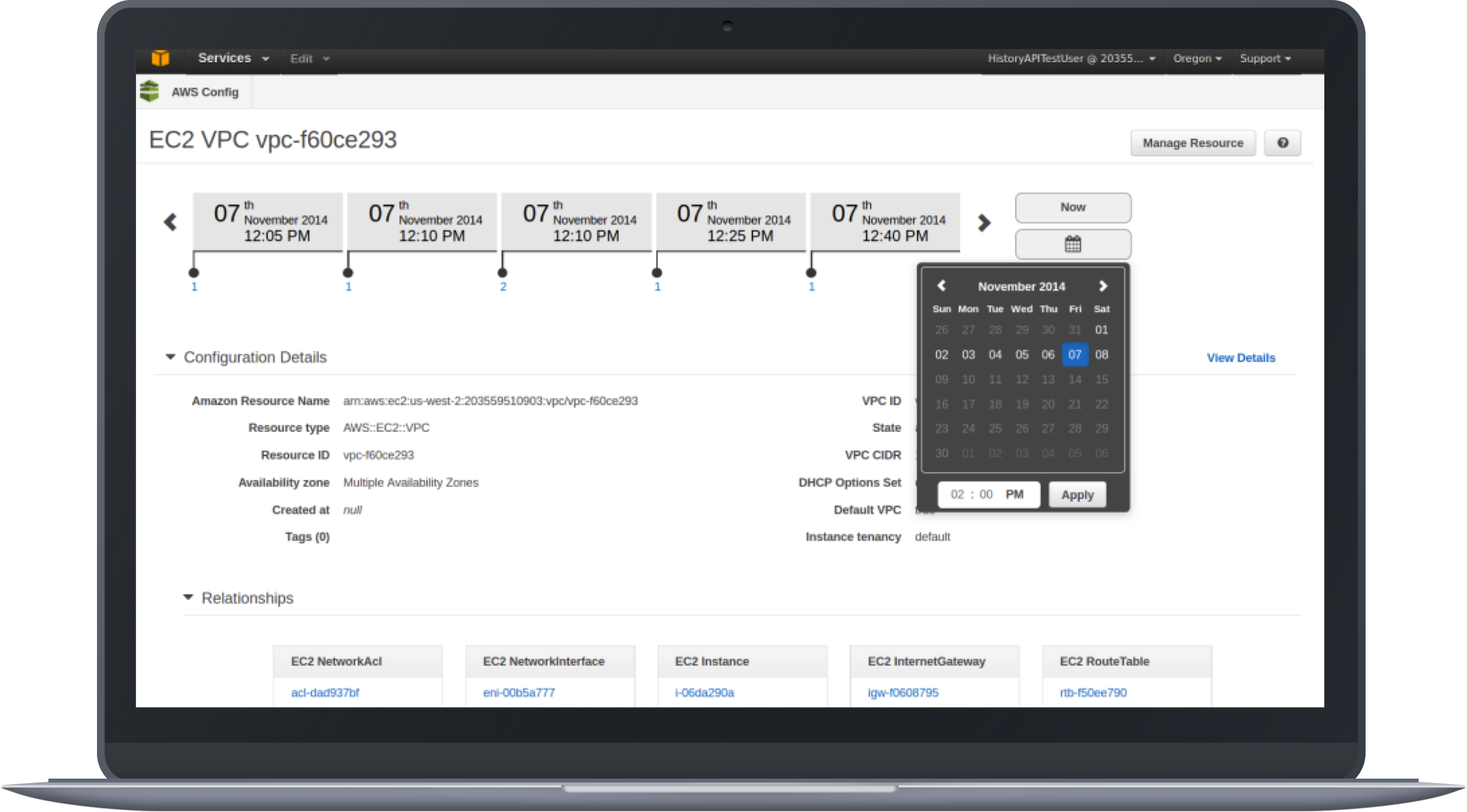
Again, one the of the most critical UI pieces of AWS Consists of the Timeline. We had to make sure that users would understand the time navigation concept.

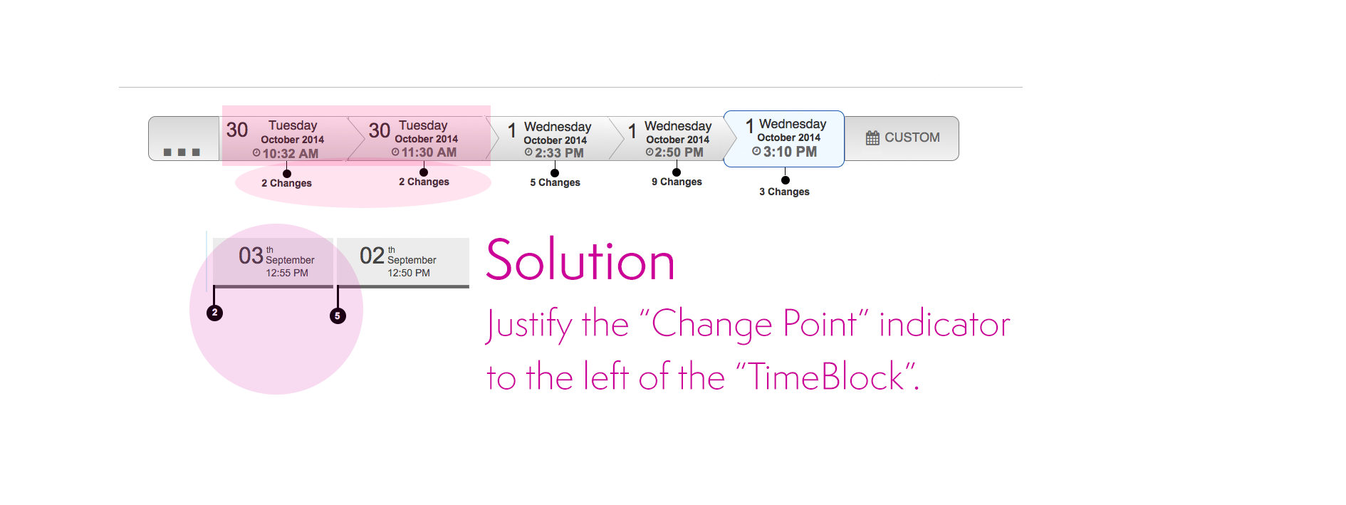
I was surprised by the issues we found testing the first concept. The main problem consisted of locating the "changes point" indicators on the timeline.

We wanted to make sure that users understand that changes happen at the beginning of a period of time. As a result, if the "Change Point" is in the middle of the "timeblock", it creates confusion to users regarding when the change occurred.

Solution. We justified the "Change Point" marker to the left. Even though that it seems like a complex concept, users did understand the meaning having the indicator of the changes in the left position on the "TimeBlock".

First iteration

...the information seems to be too clustered.

2. We've got your back

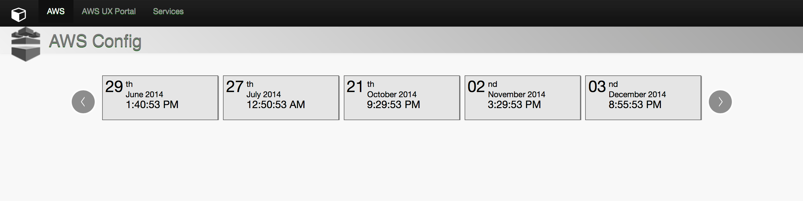
The next design shows another variation of the TimeLine. For this case, we display all the possible information inside a "block time", including the number of changes.

The problem with grouping all the information raises the difficulty of users to scan for a determined type of information.

"Block time"

......is this a flowchart?.

3. Starting Point

Another concept that displays a starting and ending point with the changes in the middle.

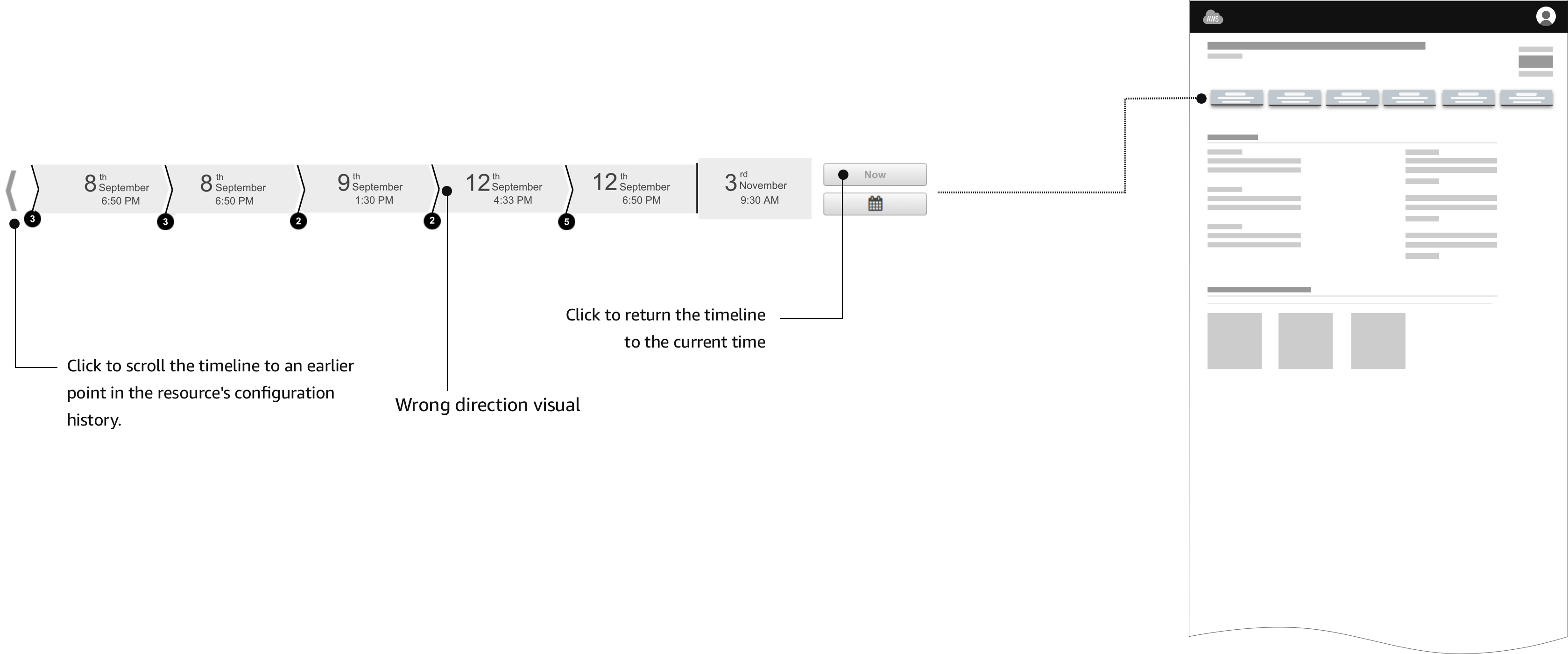
Adding a starting point to the time line creates confusion to users. The position of the starting point may vary. As a result, the interaction generates a continuous “jumping around” effect that disorients the user.

The solution is to position the starting point always at beginning of the time line (Left side).

Flowchart look and feel.


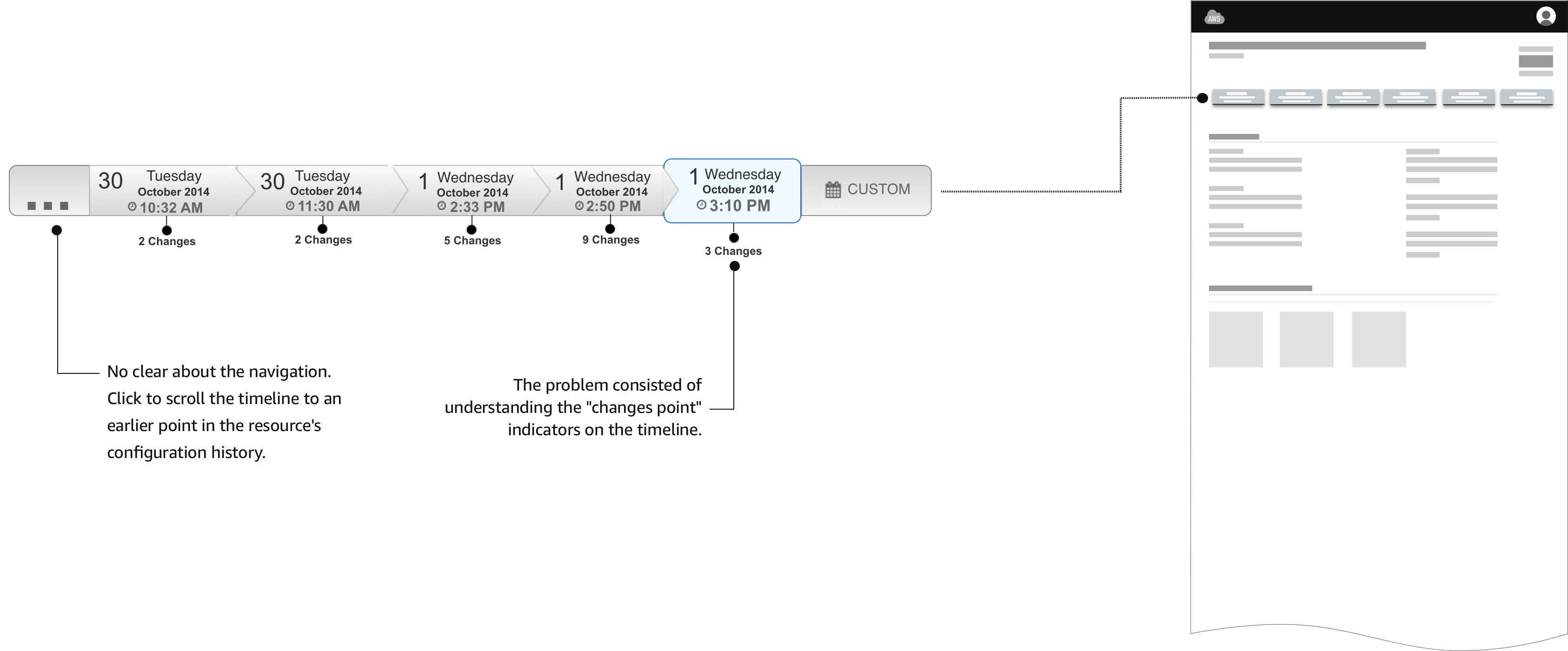
4. Goodbye flowchart

New approach in the design. This look eliminates the "flowchart" feeling from the previous designs.

The arrows on the "TimeBlocks" produces a "flowchart" effect rather than a time line feeling. In addition, the direction of the arrows gives the wrong information about the direction of the timeline. In our case, we want to represent that time starts from left to right.

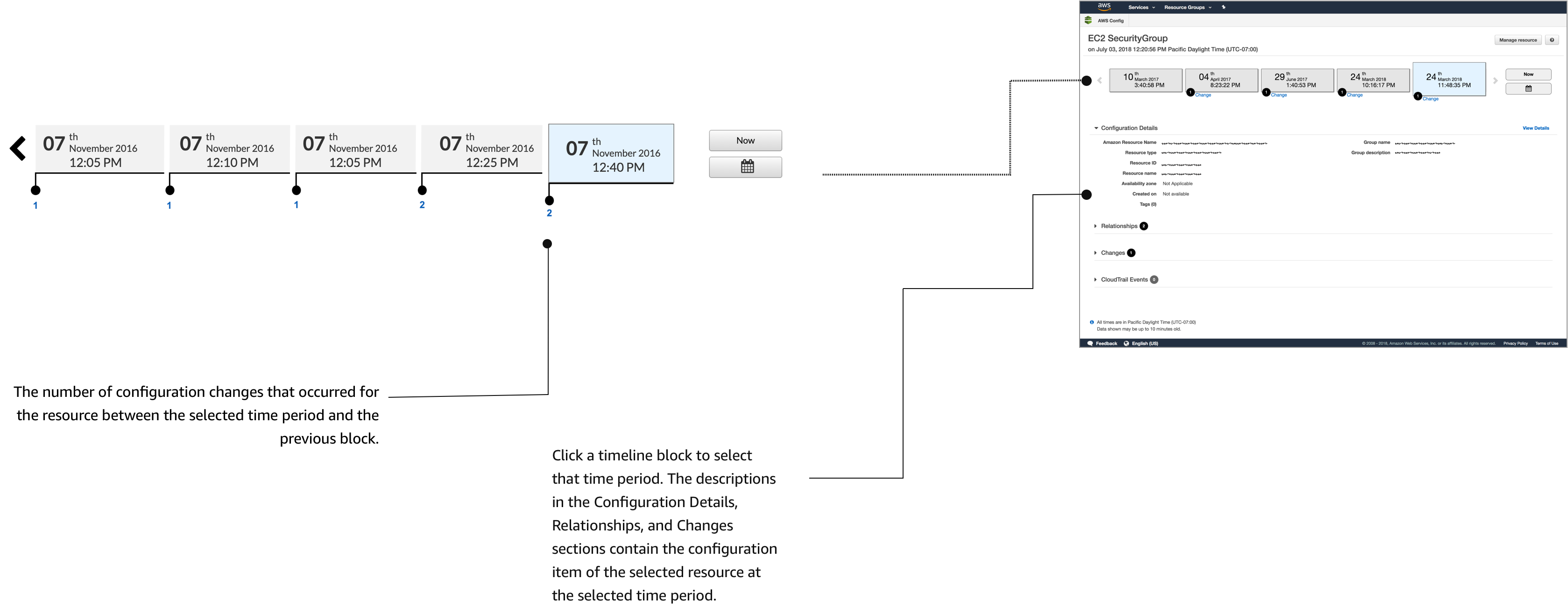
Also, circles with a number represent the number of changes. The change helps to separate the two most important pieces of information, Time and Changes.

Discoverability is an issue in this design. Many users did not understand what the number inside the circle represents. They need to mouse over to see the "Changes" label.


...and the winner is...

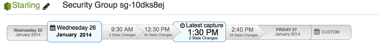
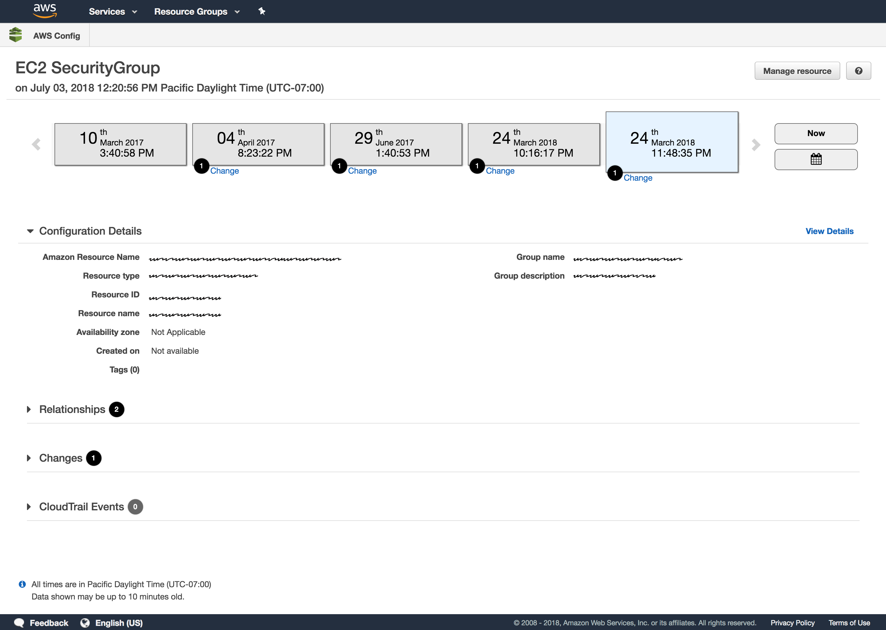
Final version presented at Re:invent 2014

Several visual design improvements help to obtain positive feedback from users. ready to test!
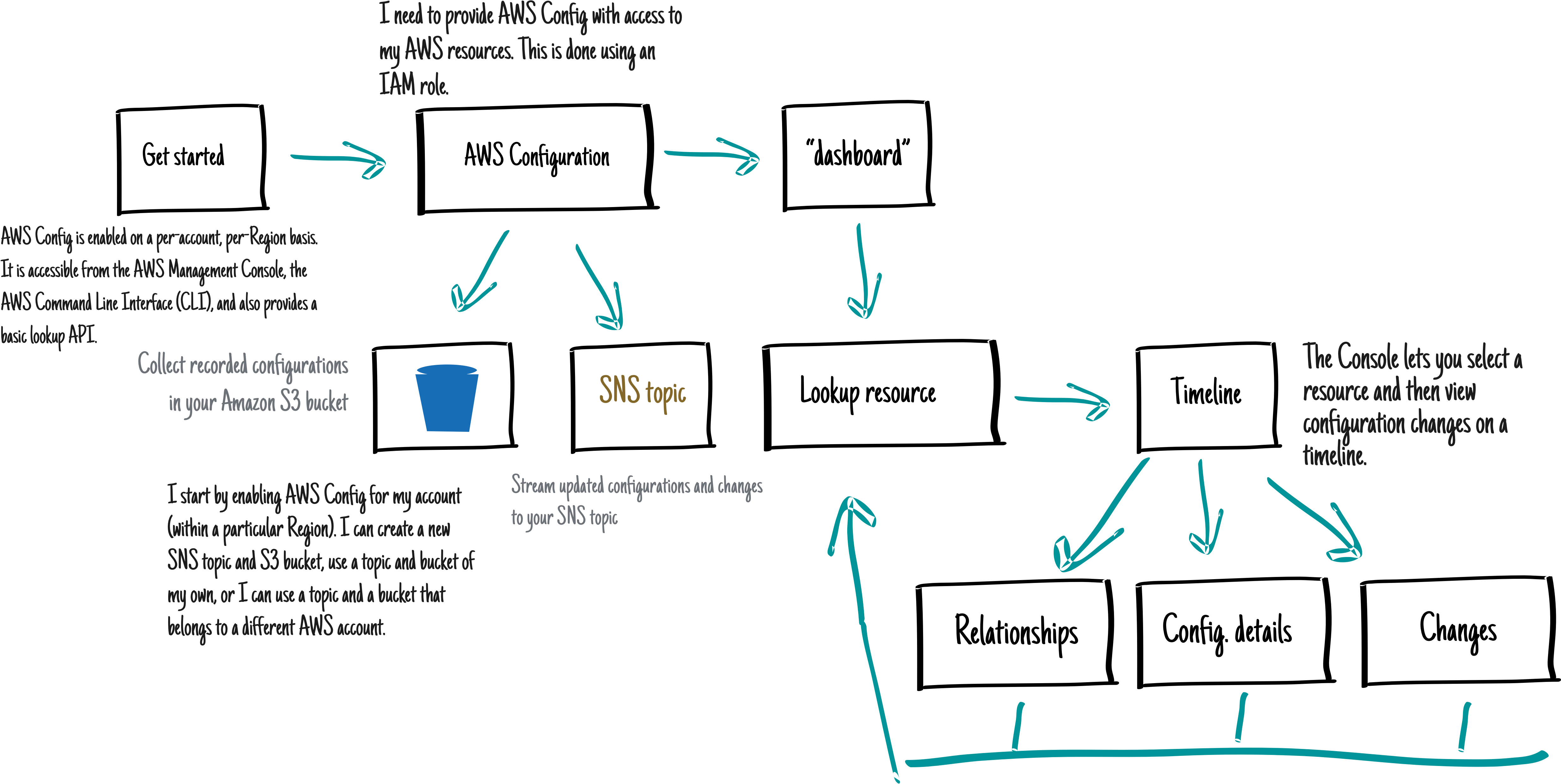
Final design. Re:invent 2014.

The Discovery

USER RESOURCES CHANGED OVER TIME

“Traveling on time revealed an opportunity to perfect the navigation experience.”

Evaluate

We tested the new Starling timeline UI, looking for usability problems. We also talked to participants about what they would use a tool like Starling for, looking for what kind of functionality is needed to solve the users’ real problems.

We had 7 participants, where 4 were already recruited as beta users of AWS Config and the remaining 3 were from our usability panel. 5 out of 7 users managed large AWS installations, while the remaining two had less than 10 instances.

  • All participants liked having a visual timeline to navigate the data.
  • All participants navigated the timeline well.
  • Starling was thought particularly useful for reverse lookups, such as seeing which instances were associated with which security group or autoscaling group.

Launching is only the Beginning

The UCD Process is circular. New features and improvements start the process again.

Final AWS Config design.

Challenges

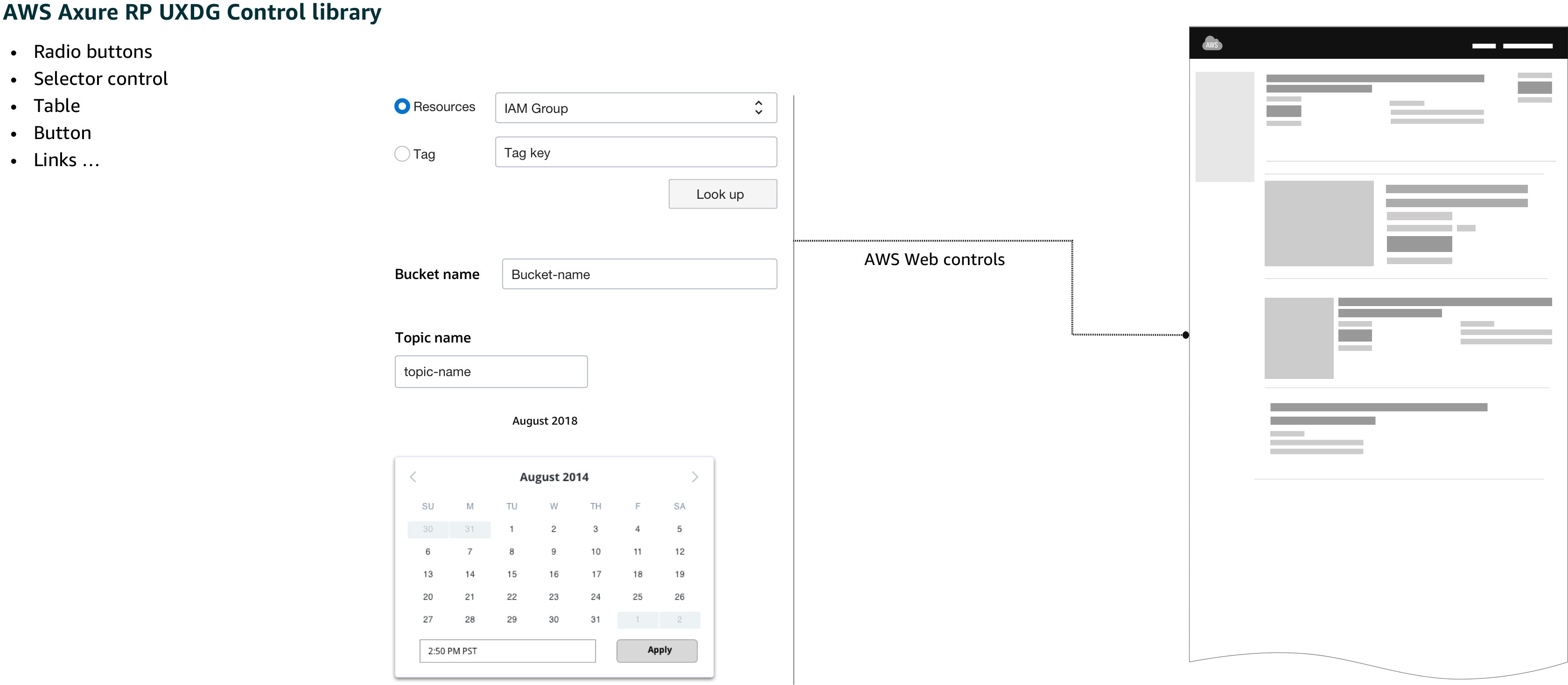
One of the main purpose of the AWS Config console is to allow users to navigate through time in order to be able to search, browse and analyze data. At that point in time, AWS lacked a control to allow the customer to navigate in time. The only control in the UI library close to what I was looking for consisted of a date picker control.

One big UI challenge that I have to face consisted of figuring out how to allow users to navigate between dates.

As a result, the biggest challenge for this project consisted of convincing leadership that the use of a timeline is the correct approach to solve the navigation between dates.

Skepticism was one of the biggest challenges that I faced during the completion of this project.

It was challenging to design a tool for navigating in time without breaking some AWS *UXDG patterns.

What the community is saying

“Carlos’s design approach has produced one of the most creative consoles for our services.”
Sr. Manager Product Management at AWS
What the community is saying What the community is saying

What I learned

What I enjoy the most during the process was talking with the potential AWS customers. I enjoy the moment when the participant allows me to understand through their perspective what they looking for, what they need, what they are struggling with.

By making prototypes, including failed ones, I have learned how to separate the user's needs from my own perspective of the solution.