Story of a timeline
-
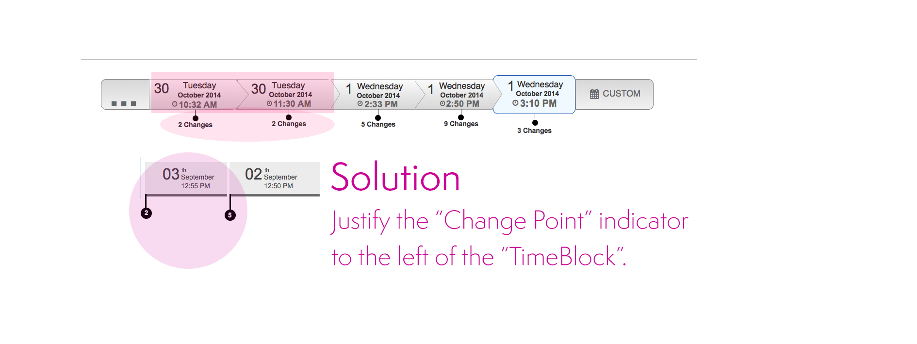
First Iteration. The main problem consisted of locating the "changes point" indicators on the timeline.
We wanted to make sure that users understand that changes happen at the begining of a period of time. As a result, if the "Change Point" is in the middle of the "timeblock", it creates confusion to users regarding when the change occurred.
Solution. We justified the "Change Point" marker to the left. Even though that it seems like a complex concept, users did understand the meaning having the indicator of the changes in the left position on the "TimeBlock".
-
Another issue consisted of comparing the current time and the "Custom" time selected by the user. The time located below the TimeLine (Left corner) shows what time is at the moment. On the other hand, the timestamp under "Custom" represents the time that users has selected to see changes.
This was a clear example of engineering overthinking. Why show the current time when users can just look at the computer’s time to see what time it is now? The current time was removed from the UI after. Amazon value Backbone applied here.
-
The next design shows another variation of the TimeLine. For this case, we display all the possible information inside a "block time", including the number of changes.
The problem with grouping all the information rises the difficulty of users to scan for a determined type of information. “The information seems to be too clustered.”
-

Another concept that displays a starting and ending point with the changes in the middle.
Adding a starting point to the time line creates confusion to users. The position of the starting point may vary. As a result, the interaction generates a continuous “jumping around” effect that disorient the user.
The solution is to position the starting point always at beginning of the time line (Left side).
-
Final version presented at Re:invent 2014
Several visual design improvements help to obtain positive feedback from users. ready to test!
-
New approach in the design. This look eliminates the "flowchart" feeling from the previous designs.
The arrows on the "TimeBlocks" produces a "flowchart" effect rather than a time line feeling. In addition, the direction of the arrows gives the wrong information about the direction of the timeline. In our case we want to represent that time starts from left to right.
Also, circles with a number represent the number of changes. The change helps to separate the two most important pieces of information, Time and Changes.
Discoverability is an issue in this design. Many users did not understand what the number inside the circle represents. They need to mouse over to see the "Changes" label.


