VIDEO LIGHTBOX DESKTOP
New web lightbox widget to increase the number of video views.
“Lightbox is a JavaScript library that displays images and videos by filling the screen, and dimming out the rest of the web page.”
To comply with my non-disclosure agreement, I have omitted and obfuscated confidential information in this case study. All information in this case study is my own and does not necessarily reflect the views of Amazon.
FINDING THE PROBLEM BEFORE THE SOLUTION
Customers express confusion with the lack of consistency between the different types of lightboxes presented.
MY ROLE
I led the design of Video Experience across iOS and desktop since the outset of the project in March 2017.
I led efforts to evolve the UI and address customer pain‐points related to the browse, viewing, and discovery the video experience.

Customer Insights & Ideation
I partnered with one project manager to uncover insights and translate concepts into features that address customer behaviours and motivations.
Experience Strategy & Vision
I created frameworks and prototypes to share the vision, design principles and content strategy. This helped to evangelize ideas, gain alignment and drive decision making.
Planning & Scope Definition
I defined the product with my project manager partner. I evangelized customer goals and balanced business goals. I prioritized and negotiated features for launch and beyond.
Oversight & Coordination
I designed across different browser platforms to translate product features for desktop context.
Design Execution & Validation
I designed down on desktop. I executed wireframes, prototypes and design specs.
Leadership
I designed up and presented works to gain buy‐in from executives, senior stakeholders and many other Amazon teams throughout the project lifecycle.
SOLVING THE PROBLEM
Objectives
- Consistency.
- Help Customers discover information that meets their needs.
- Help Customers learn about products via video.
- Personalization.
- Control of Information.
The biggest problem consisted of the multiple access points that we were presented to users when viewing video media. The experience was different based on the location. In other words, users could reach a lightbox, with different look and feel from the following locations:
- Search results page.
- Product detail page.
- Video detail page.
- Video Shorts portal.
There were three different experiences when accessing the lightbox from any of those entry points. As a result, customers were rising arguments about the inconsistency of the experience.
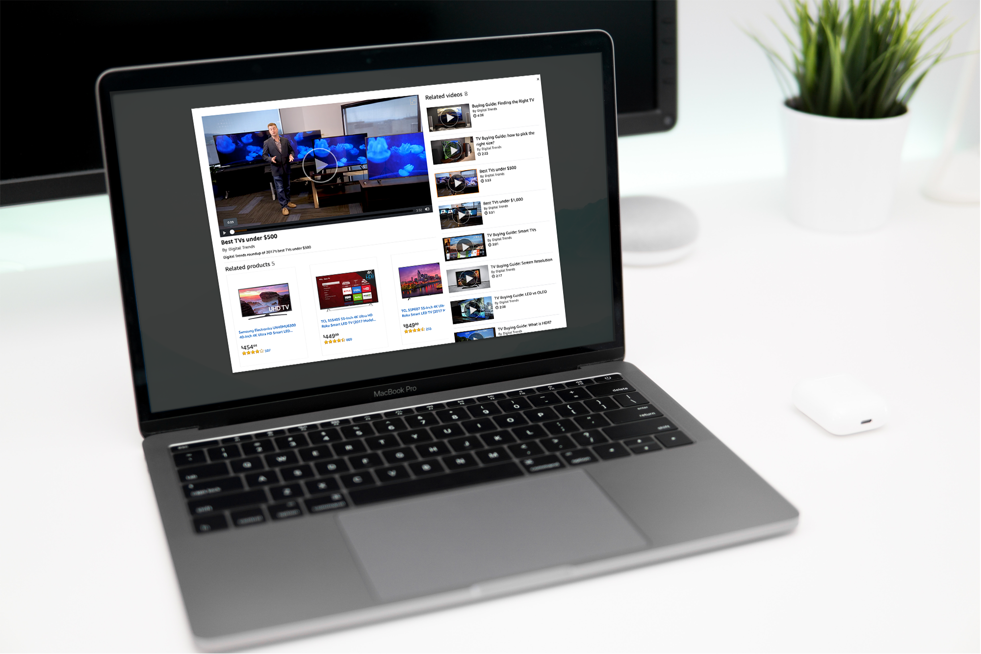
FROM THE PRODUCT DETAIL PAGE
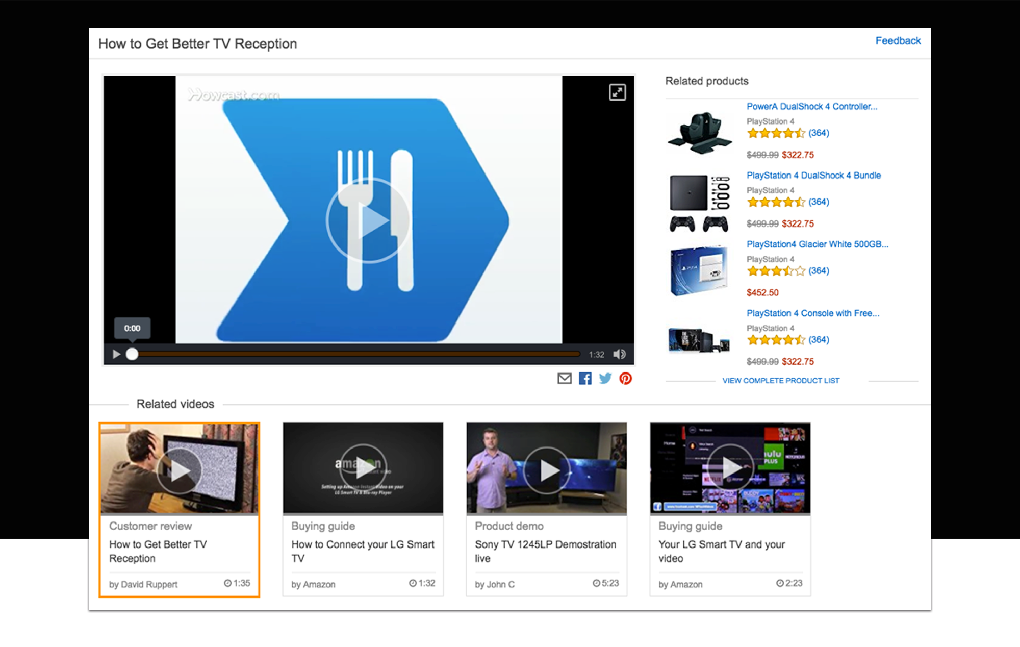
When accessing the lightbox from the product detail page, users were provided with the following components plus a different UX from the version mentioned before. On the detail page of an item, there are videos next to images to help customers to know about the product. Clicking on a video opens the following lightbox with these components:
- Modal.
- Related products.
- Related videos. (Section title)
- Report content.
- Social media sharing.
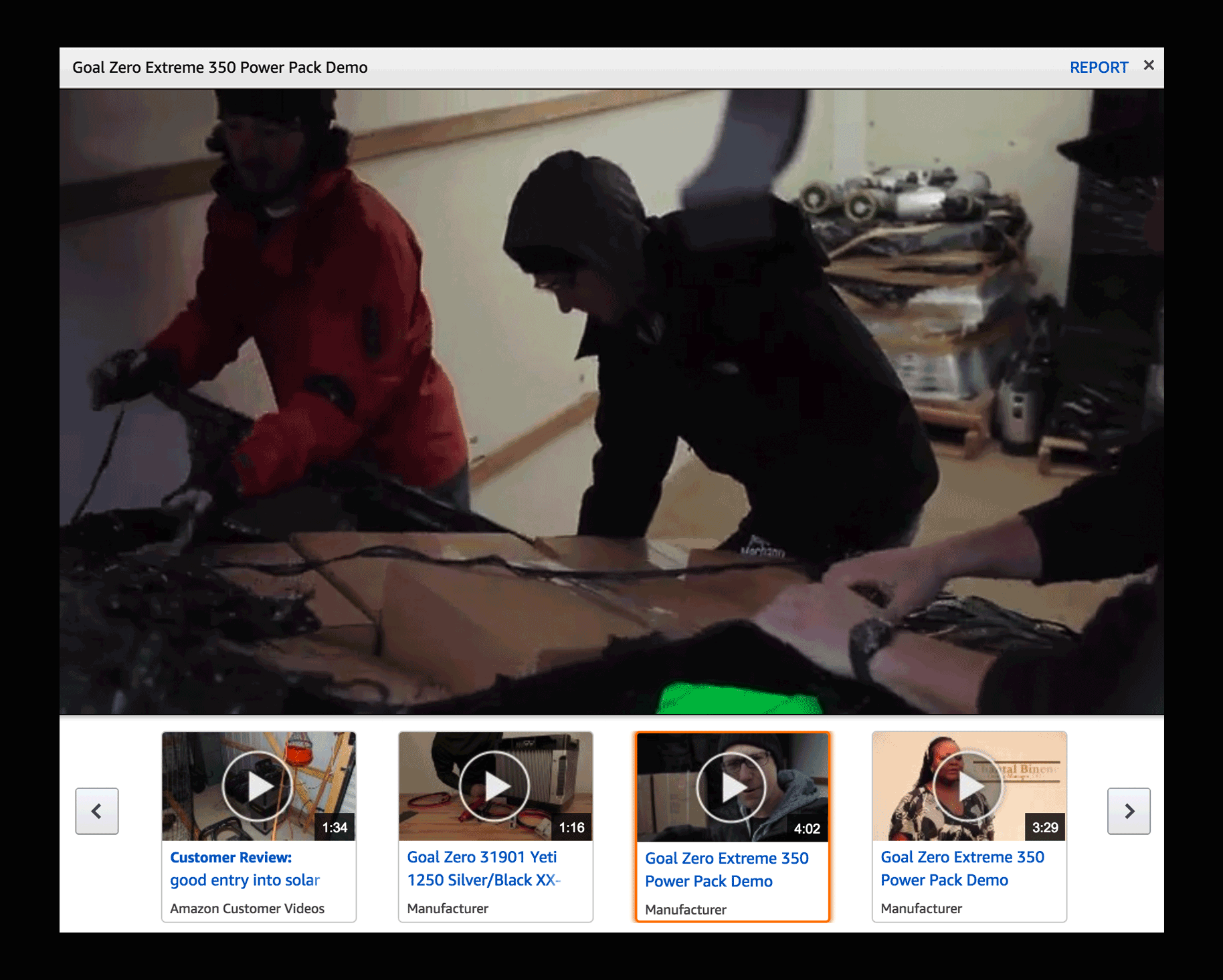
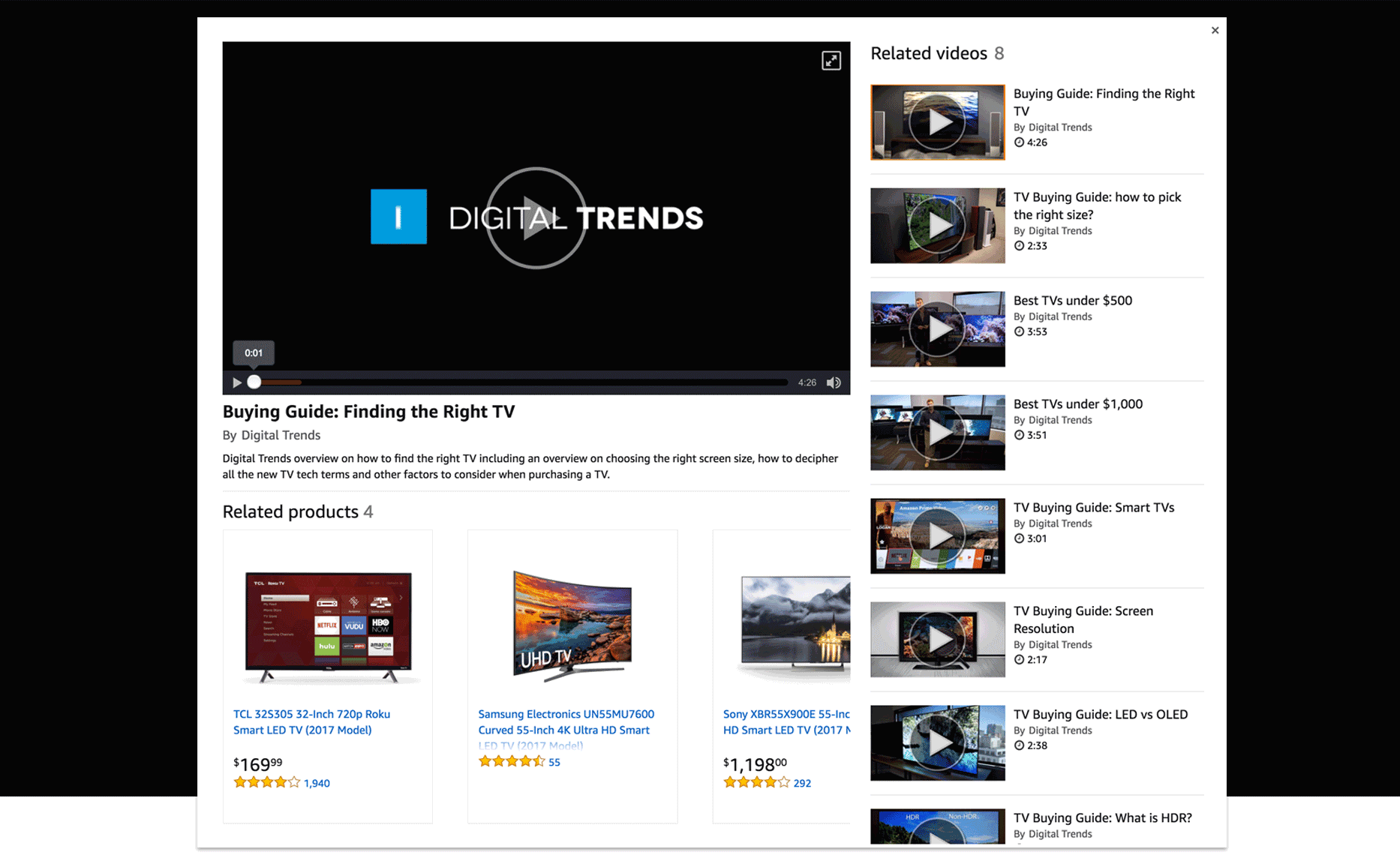
FROM THE VIDEO DETAIL PAGE
User searches for a video via the Video Short portal. Clicking on the video opens the lightbox that contains all the information about the video.
- Modal.
- Related products.
- Related videos.
- Social media sharing (different location).
- Report (different location).
FOR NOW AND FUTURE
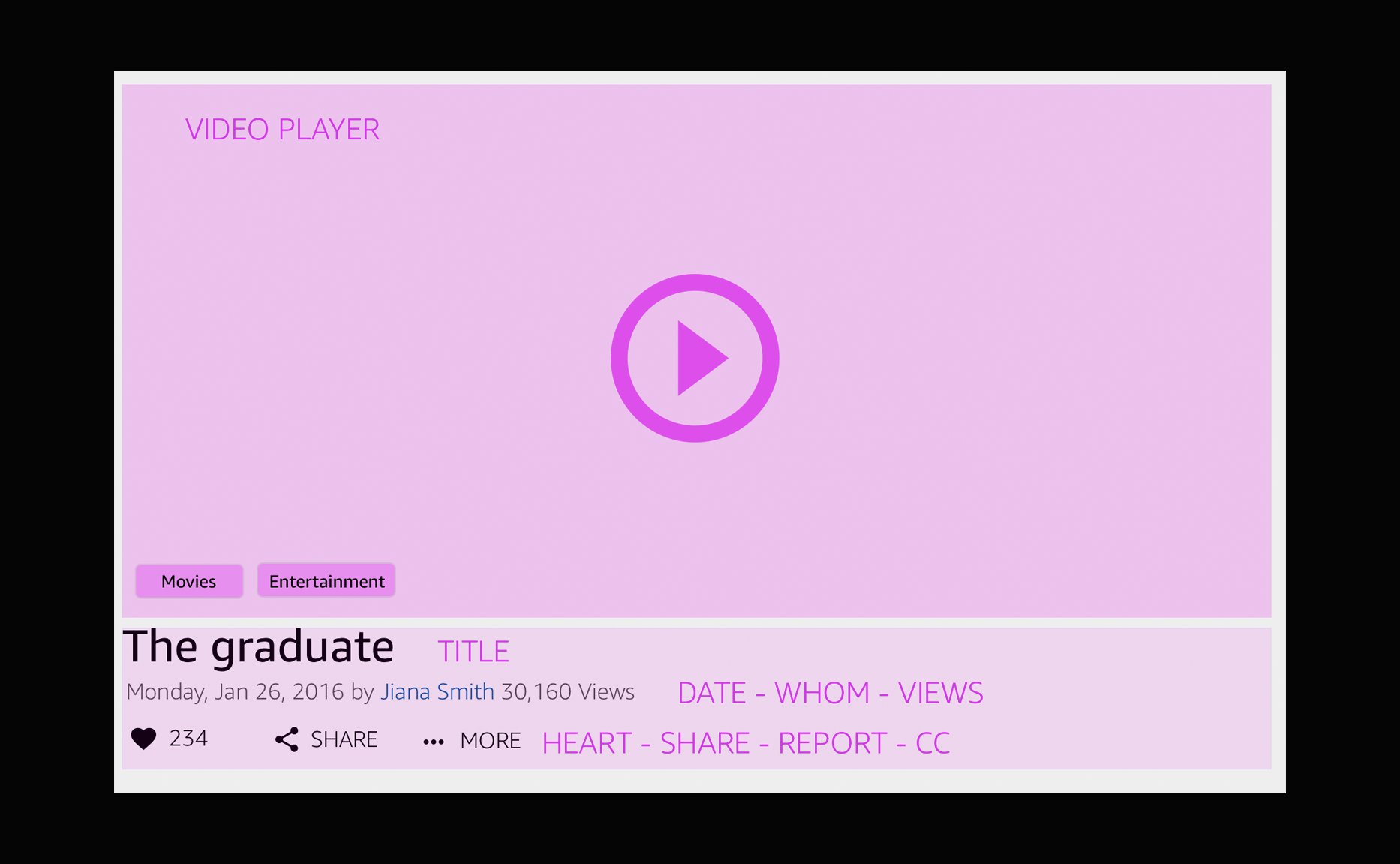
What components?
What features I think users might like to have for navigating and watching videos when they are in the lightbox control.
- Video player.
- Video title.
- by Whom?
- Related items.
- Related videos.
- Social media sharing.
- Report content.
Based on customer feedback, it is clear that we need to keep the viewing and discovering experience consisted of the customer. The challenge resides in how to show a consisted view based on the type of information displayed.
As we have described above, the lightbox might contain different types of data based on the entry point. How can we solve this challenge?
Solution
ONE LIGHTBOX TO RULE THEM ALL
CONSISTENCY WITHIN THE WATCHING EXPERIENCE
Users will learn faster how to use the design. Having inconsistent interface is like trying to communicate with the user in several languages.
Consistency eliminates confusion. When the user feels confused the next step is to feel frustration.
"Blocks"
SOLUTION
The idea consists of having a canvas where blocks of information can be shown and move around based on what we want to present to the customers. For instance, the video player, including all its information becomes a block. Then, the related video section shows a different block and so on.
Consistency saves money and time!
Consistent design is frequently built by predefined components. This allows designers and stakeholders to make decisions quickly without spending precious time to argue. This saves time that can be used to build the product and make incremental improvements.
Detailed Design
Communicating Design
Amazon upholds infamously high standards for the work it produces both externally for customers and internally for team members to consume.
This has created a culture which seeks to earn trust through accountability, diving deep into the details and inviting others to scrutinize work. Heavy documentation is the artifact of such a culture.
The complete size of this project meant that I needed to have everything figured out before teams would commit to moving forward with the work. Many teams involved in the project needed to see it in a tangible delivery.
For each feature phase, I went through cycles of requirements, consensus, approvals, detailed specs and handoffs.
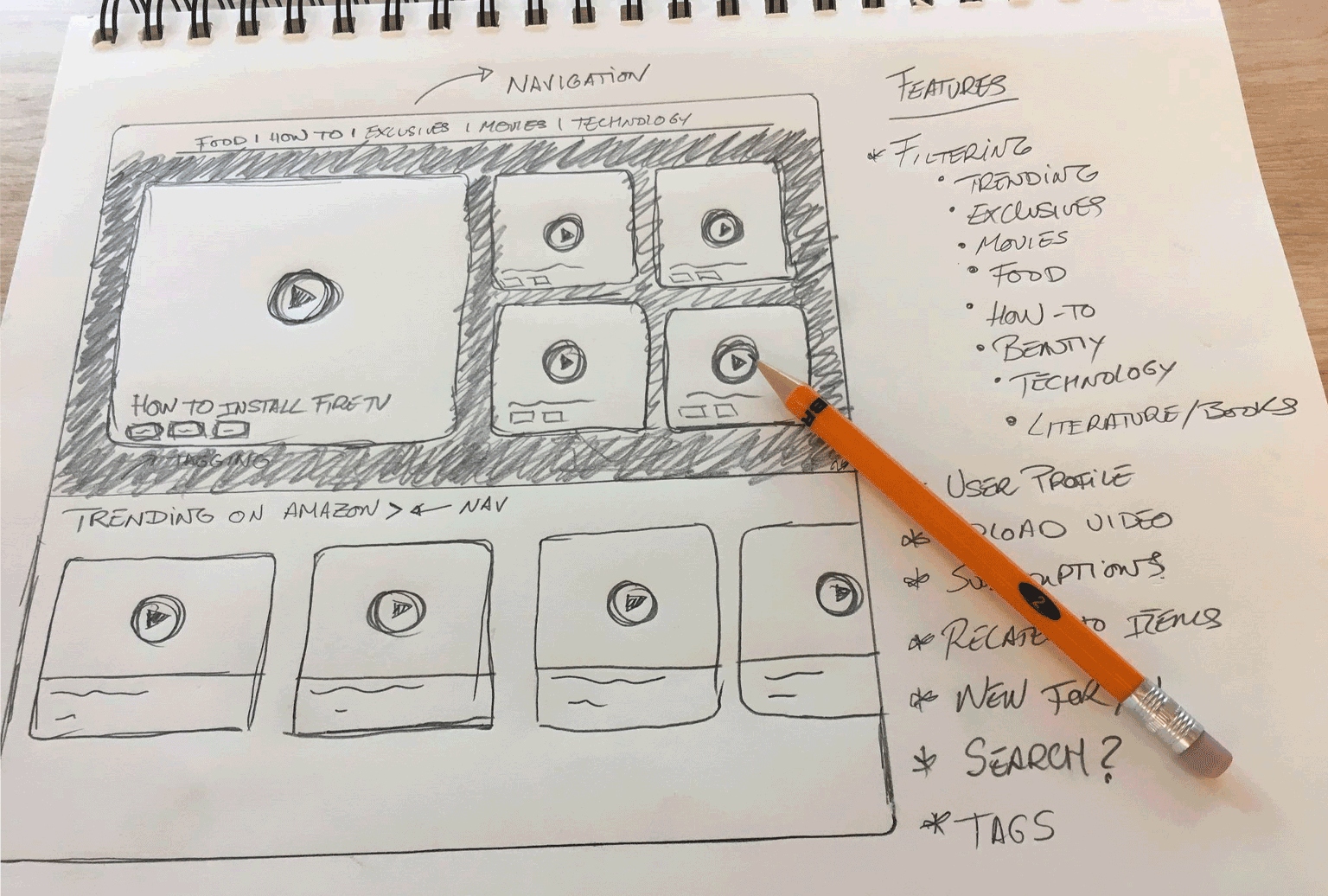
My process involved sketching and white‐boarding concepts and flows with my PM partner and then translating these directly into hi‐fidelity design comps. Since I was working with many existing design patterns, it was relatively easy to move straight into hi‐fidelity designs.
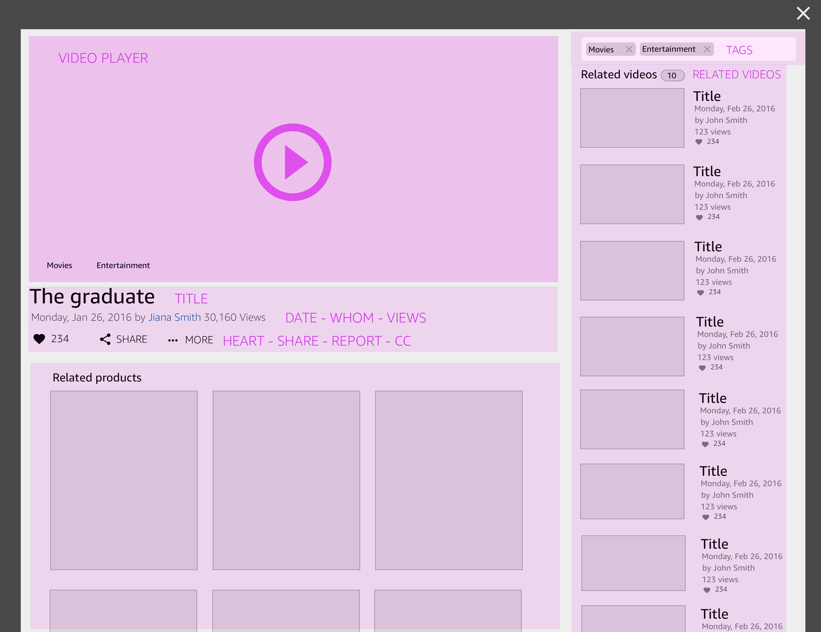
Example: Lightbox after selecting a product from the search results page
Exploration
The first iteration did not include bigger changes from the original. That was not thinking big for me. Keeping almost the same experience will not address the current issue regarding the number of videos versus the number of products displayed on the lightbox. There are more videos to show to customers than articles. As a result, users have a reduced overview of the videos we are presenting. Navigation and exploring increase so video engagement is minimum.
We have to remember that the users are coming to this lightbox after selecting a video. Customers were asking for video information rather than products. In addition, base on web standards, videos usually are positioned on the left side of the lightbox for easier discoverability.
“Prototyping was the most effective way to gain meaningful feedback…”
PROTOTYPE
The HTML HTML prototype (click on any video to open lightbox) exposed usability issues straight away and avoided natural omissions that are often made when wireframing. The process, as a whole, was becoming less time consuming because small changes weren't taking hours to rectify and the code was completely re-usable when it came to the production stage.
If you're building a prototype for the web, it makes sense to build it in its natural environment as it provides as real an experience as you can hope to achieve. Understanding how to build your designs can also give you a greater affinity with developers; they'll be more open to your ideas and able to communicate theirs better too.
It also has the benefit that you can take full advantage of all the web has to offer. Your prototype can adapt to the width of the browser window but a graphic wireframe can't. This is useful when demonstrating how your site adapts at different screen widths.
Deeper Insights
EVALUATE
From the beginning of the project, I was focusing my work trying to understand the necessities of our customers. We conducted several tests to gather data regarding how users navigate and search for videos. The feedback obtained helped us decide between the different concepts that I was proposing.
We tested the new UI with five participants, looking for usability problems. We also talked to participants about what they would use video results for, looking for what kind of functionality is needed to solve the users’ real problems.
We tested the new UI with five participants, looking for usability problems. We also talked to participants about what they would use video results for, looking for what kind of functionality is needed to solve the users’ real problems.
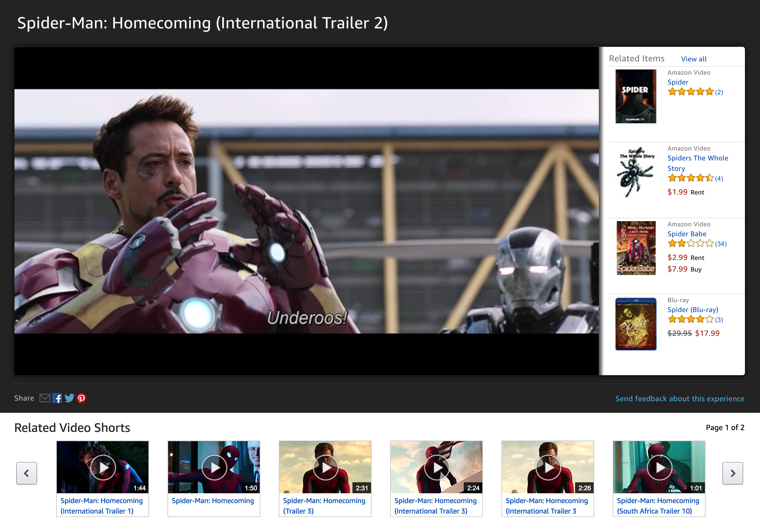
The Result
Introducing the New Experience
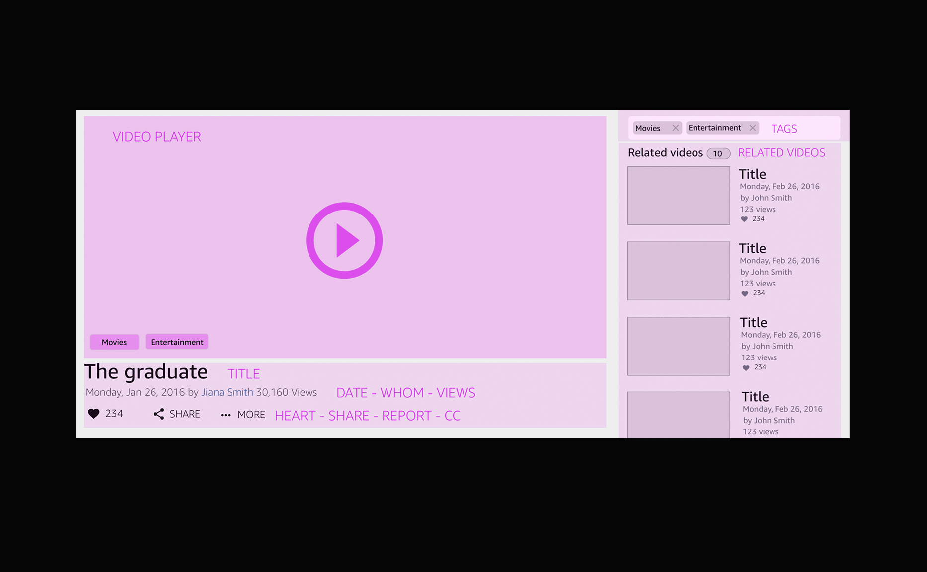
New design shipped in December 2017
The design follows the standards used on other video platforms. I wanted to keep the new experience consisted of other models. The video player is centered on the lightbox and the navigation panel located to its right.
The section below can be used to show different types of information according to the necessity. For example, it can show the related products associated with the video.
“I want the right navigation section”
The completion of this project helped me understand and learn more about how to work with other organizations within the company. One thing that I had to put into practice constantly consisted of challenging decisions when other stakeholders disagree. One example includes the location of the “Related products” on the Lightbox. On one side we were pushed to locate the product on the right side of the UI.
The search team conclusion consisted of keeping the old experience as it was. However, thinking big alllowed me to convice the team otherwise. My reason states that the amount of videos is larger than the list of the related products. As a result, the location of the videos on the side allows us to display a bigger example of related videos with an easier up and down scrolling navigation. The current issue with the former experience consisted of the amount of real state wasted when presenting less product than videos.
The Impact
Positive results and much more to do
The redesign of the lightbox on web has had a positive impact on the video viewing experience. The video engaging rate has been significantly increased which means customers continue to watching videos on desktop.
I have intentionally omitted confidential data here.