Video Lightbox

I have omitted and obfuscated confidential information in this design case study. All information in this example is my own and does not necessarily reflect the views of Amazon.

Just phone

Mobile lightbox

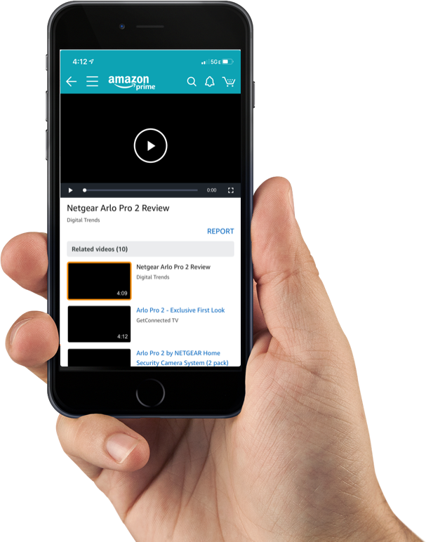
This lightbox serves as a tool to browse, view and discover video content within amazon.com. Both, desktop and mobile versions are available for these purposes. The following design case focuses on the redesign of the mobile version.

Project Details

  • Company: Amazon
  • Product: Feature
  • Year: 2017
  • Tools:

SUCCESS METRICS

  • Conversion Rate (CR)
  • Monitoring Customer Satisfaction.
  • Lowered bounce rate.

Why?

Our video lightbox got negative reviews because users weren’t enough engaged with the viewing, browsing and discovering experience. Based on the content of the reviews, we hypothesized that users were dropping off after watching part of the first video.

This project will employ the Amazon philosophy of Mobile First. As a result one of the primary goals of the this project is to increase engagement in video views on mobile

Understanding the past experience

The old lightbox version was important for the launch of the video viewing experience during a period, however it needed new concepts and the application of the new brand guide.

Old experience
Previous experience.

In the former lightbox experience, customers click through to a lightbox page that shows a single video player at the top and a horizontal carousel of video thumbnails below. The lack of visibility of the rest of the video options decreased the level of engagement. Also, the uncommon pattern used for this navigation influenced customers to leave the screen after watching a video.

I decided to follow the Lean UX Design Thinking process to make sure that my design decisions were supported by user research and feedback.

UX design thinking
UX Design Thinking process.

My role

I was the sole UX designer on a team comprised of 3 developers and a PM. I was responsible for determining the overall design direction of the new lightbox, while collaborating with the rest of the team on the ideation phase.

Understanding the user

We began by exploring our assumptions about the experiences of user browsing, viewing and discovering video content via mobile. For example, our first reaction was to separate viewing from browsing. After speaking to our users we would end up finding a better approach.

With this improved knowledge, we created an interview script. We wrote the questions to prompt the interviewees to tell their story in their own words. The intention was to get these potential users to tell us what was important to them when browsing, discovering and viewing video content.

Pain points

  • Odd navigation.
  • Text hard to read.
  • Not clear about purpose of the carousel.
  • Title too big.
  • Missing information about the video.

With a list of pain points expressed by our users, we conducted a few more interviews with an updated script of questions to gain more context around pain points.

Key insights:

  • Video reviews help customer to make product decisions.
  • Quality of video is important.
  • Video description will help users to select what video to watch.
  • Navigation depends on the type of user. Viewers vs browser.

From there we took all of our findings and created a user flow to represent the pain points in detail.

Pain points
Mental model of what our users were going through.

Competitor Analysis

Next, I conducted competitor analysis of other apps that allow users to watch videos via mobile. I look for positive and negative application behavior. I don’t want to reinvent the wheel, so analyzing features and interactions from other apps will help me to make better decisions during the ideation process.

Our competitors included Facebook, Youtube or Instagram.

We found that the most common pattern used in other video platforms provides vertical navigation when browsing videos.

Facebook and YouTube navigation
Facebook and YouTube navigation.

Defining the product

Now that we understood our users and narrowed down the specific problem we were going to solve, we could decide how we would go about it. An app definition statement will help us to identify what features we think users might like to have to make the viewing and navigation simpler and more efficient.

  1. Video duration. How long is the video.
  2. Provider. Who is the owner of the video.
  3. Provider badge.
  4. Customer review label. Is this video from a Customer or a Seller?
  5. Timestamp. How old is the video.
  6. Feedback. Link to the Report section.
Defining the product
App definition.
I usually start the design process with low fidelity sketches.

Ideate

My ideation process usually starts using pencil and paper. This is the way to iterate through design ideas quickly. In addition, sketching is an inexpensive way to create a first approach to the UI and get quick feedback.

After a few sketches, I felt ready to switch from paper and pencil to Sketch. I created wireframes for testing purposes. Focus on user flows, navigation, rough layouts, and interactions.

user testing: Round 1

Navigation

Tests

5

"Fixed"

4

Multitaks

5

Cards

5

Four of the five participants indicated the preference of navigate through the videos while watching the video located at the top of the screen. This model ("fixed") allows users to be able to watch any selected video while the vertical navigation let them browse other media content without interrupting the viewing experience.

Based on the user feedback obtained during the sessions, I proposed to leadership to move forward with the "Fixed" model.

“I like to watch a video while I can navigate on the screen.”
Fixed vs Cards concepts
"Cards" vs "Fixed" concepts.

Evaluate Mobile with Axure Rp

Navigation

From the beginning of the project, I was focusing my work trying to understand the necessities of our users. We conducted several Guerrilla tests to gather data regarding how users navigate and search for videos. The feedback obtained helped us decide between the different concepts that I was proposing.

We tested the new UI with five participants , looking for usability problems. We also talked to participants about what they would use video results for, looking for what kind of functionality is needed to solve the users’ real problems.

Fixed vs Cards concepts
"Card" prototype used during testing  .
Fixed vs Cards concepts
"Fixed" prototype used during testing .

In order to obtain more accurate feedback from users, I uploaded the Axure RP files to a server. As a result, I was able to access the prototype from a mobile device providing a very realistic experience to the participants when testing.

user testing: round 2

Video feedback

Imagine that the quality and content of the video you just watched is outstanding. How would you provide feedback on the video? How do you know that your feedback has been provided?

Design requirements

  • User needs to Sign In in order to cast a vote.
  • On/Off vote.
  • Mobile/Desktop.
  • No negative feedback. (Allow users to only provide positive feedback. Example only Thumbs ups.

First case: "Thumbs Up" icon to provide video feedback.

Why re-invent the wheel? Facebook has taught us the meaning of liking something with the user of "thumbs up". It makes sense to me to introduce this old habit to our users for an easy understanding of the experience.

Thumbs up concept

Tests

5

"Like"

4

Facebook

3

Dislike?

5

Feedback included the similarity with the experience with Facebook. Also, many of the participants were confused about why there are not a "thumbs down" option.

Second case: "Smiles" icon to provide feedback.

Another team has the infrastructure of "Smiling" already built so this option benefits the use of resources and time.

Smiles concept

Tests

5

Funny?

4

Facebook

4

Sad?

3

Participants interpreted the "smiling" act of providing feedback with the content of the video being funny. Also, they use the word "Facebook" to refer to the smiling experience was a common denominator.

“This is like the thumbs up on Facebook?”

Third case: "Useful" + "Thumbs up"

Based on the previous feedback, the overall feeling from the users was related to what they were providing feedback for. Quality of the video?, Content? product? As a result, I decided to make things clearer to the customer and I incorporated the string "Useful?" in summed with the thumbs up icon. The main purpose of these videos is to provide customers with guidance content on how to select and evaluate products and then encourage them to continue their research with additional video content on mobile. A simple question like "useful?" provides enough content to the request of providing feedback against the video content.

Helpful concept

The positive feedback received about this last approach helped the team to decide to present customers with this new way to ask for video feedback.

Communicating design

I created design artifacts providing the devs the CSS styles to accelerate the building phase and reduce coding time.

redlines example
The new experience

New Experience

Launching Is Only The Beginning

The design process for the mobile lightbox continues evolving. Many missing features were eliminated from the original proposal due to time and technical constraints.

One feature that I thought it was mandatory for users consisted of being able to provide video feedback and to display the numbers of views that each video reflects. What is the point of presenting a variety of videos without a reference to the quality of the videos? Remember that the whole goal of this project consists of providing guidance when purchasing an item via videos. How can users know what videos are helpful?

The redesign of the lightbox on iOS and Android has had a positive impact on the video viewing experience. The video engaging rate has been significantly increased which means customers continue to watch videos on mobile.

I have intentionally omitted confidential data here.

Carlos Marin Burgos
Website Designed and Hand-Coded by Carlos Marin Burgos