VIDEO LIGHTBOX
New mobile lightbox widget to increase the number of video views.
“Lightbox is a JavaScript library that displays images and videos by filling the screen, and dimming out the rest of the web page.”
To comply with my non-disclosure agreement, I have omitted and obfuscated confidential information in this case study. All information in this case study is my own and does not necessarily reflect the views of Amazon.
FINDING THE PROBLEM BEFORE THE SOLUTION
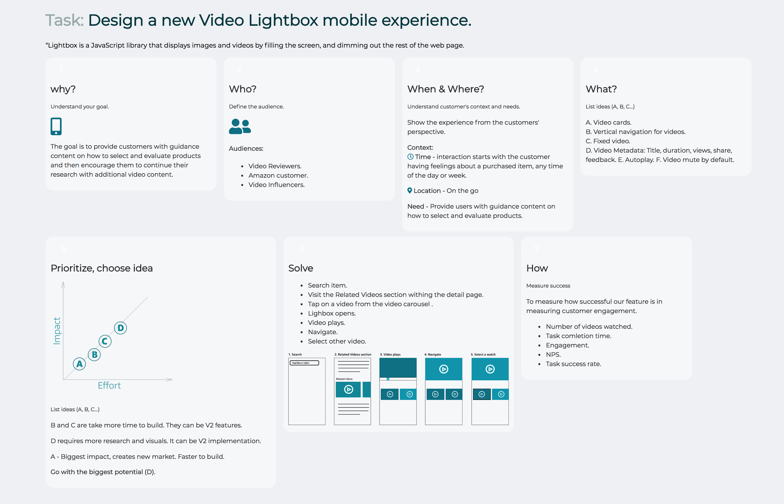
The goal is to provide customers with guidance content on how to select and evaluate products and then encourage them to continue their research with additional video content.
MY ROLE
I led the design of Video Experience across iOS and desktop since the outset of the project in January 2017.
I led efforts to evolve the UI and address customer pain‐points related to the browse, viewing, and discovery the video experience.

Customer Insights & Ideation
I partnered with one project manager to uncover insights and translate concepts into features that address customer behaviors and motivations.
Experience Strategy & Vision
I created frameworks and prototypes to share the vision, design principles and content strategy. This helped to evangelize ideas, gain alignment and drive decision making.
Planning & Scope Definition
I defined the product with my project manager partner. I evangelized customer goals and balanced business goals. I prioritized and negotiated features for launch and beyond.
Oversight & Coordination
I designed across different mobile platforms to translate product features for mobile context.
Design Execution & Validation
I designed down on mobile. I executed wireframes, prototypes and design specs.
Leadership
I designed up and presented works to gain buy‐in from executives, senior stakeholders and many other Amazon teams throughout the project lifecycle.
Design Canvas
Framework
SOLVING THE PROBLEM
How can we encourage more Product Related Video views?
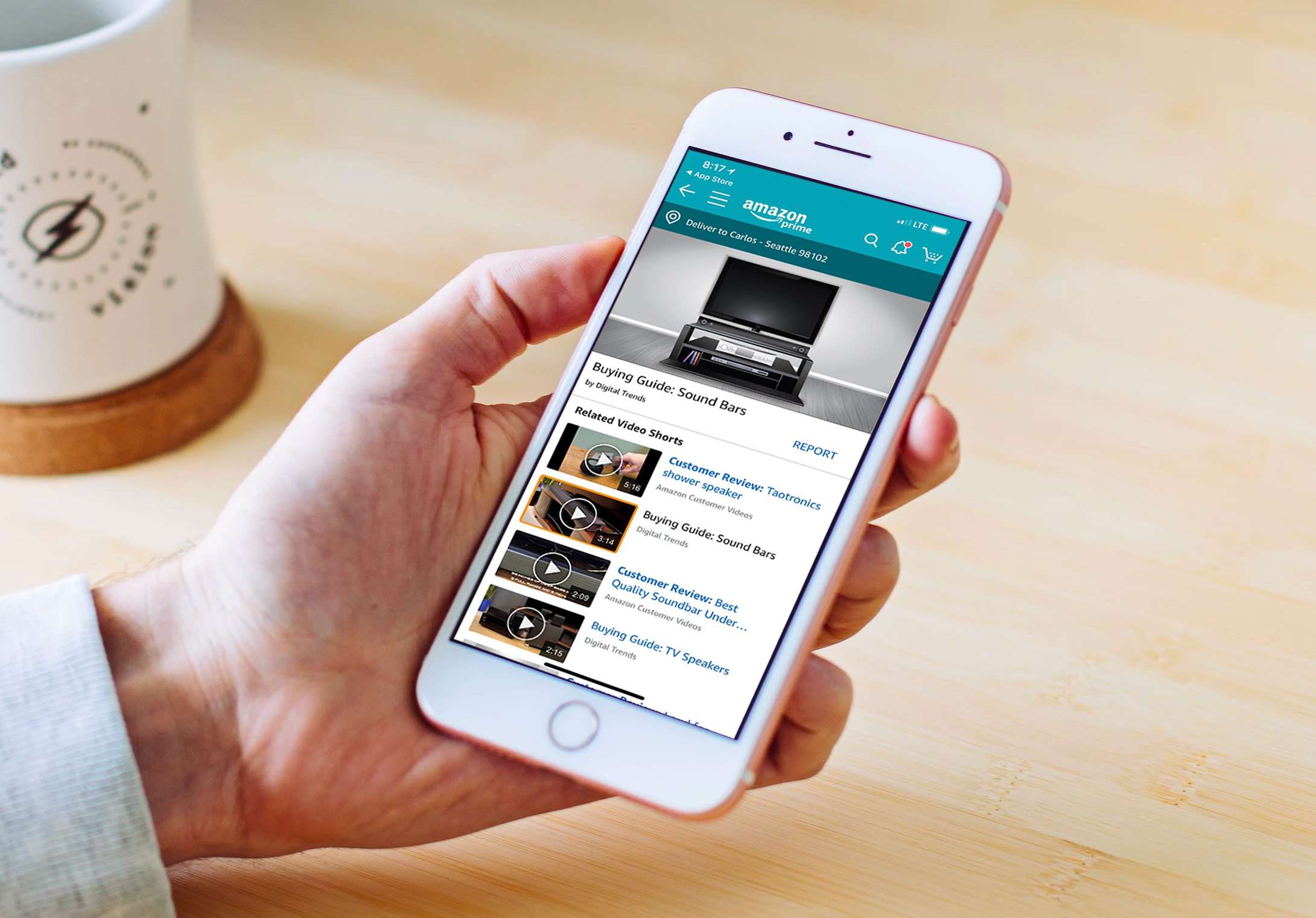
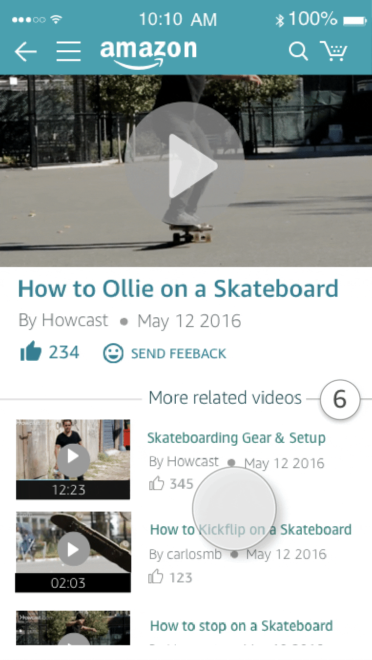
Within the detail page of a product on the page, there is a section where videos related to the product are show. The section is called "Related Video Shorts." These videos can influence others about the benefits and disbenefits of the product.
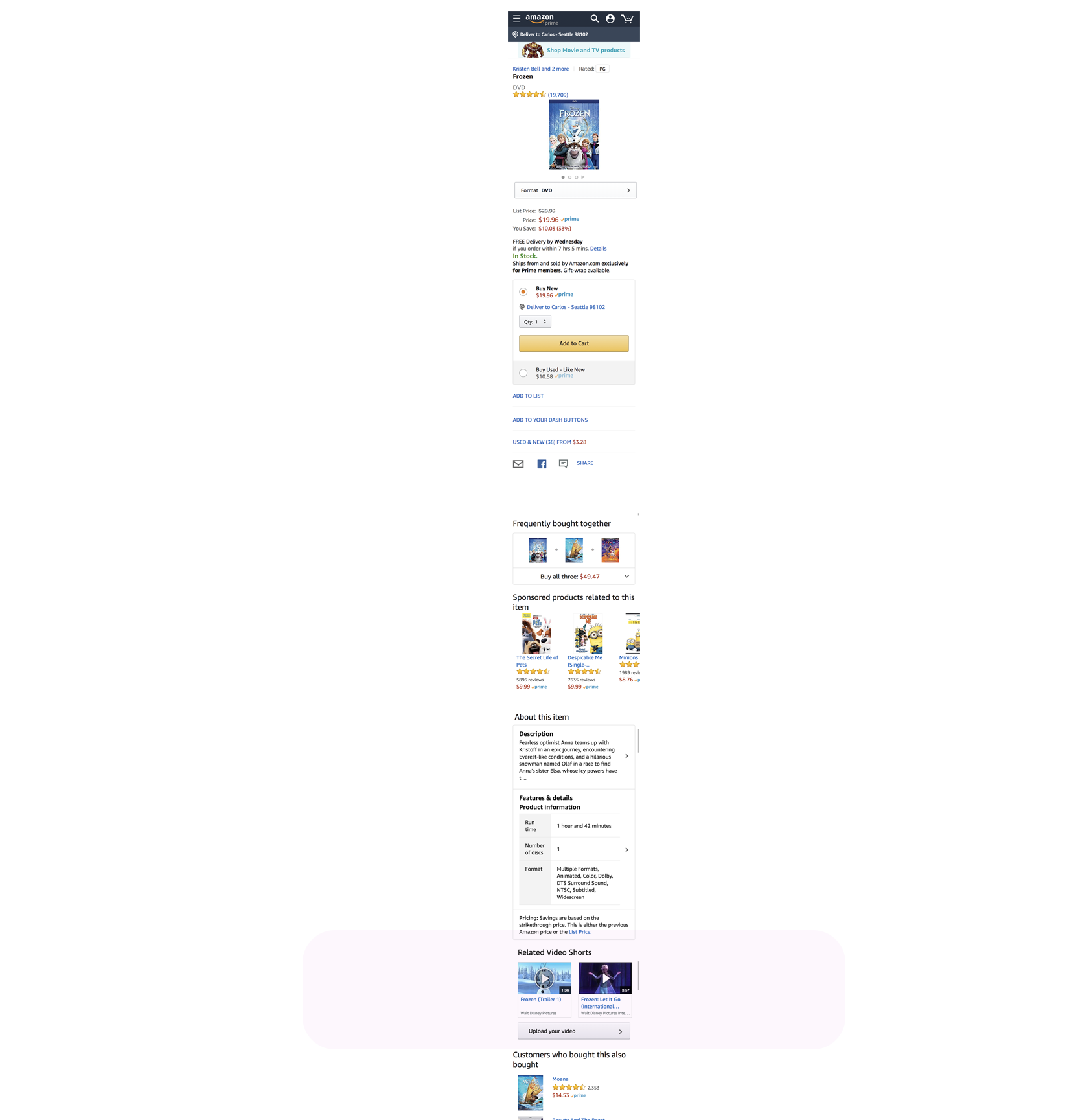
Tapping on one of the videos, the Lightbox opens to show the selected video.
Objectives
- Friction-free browsing through video content.
- Engaging UX.
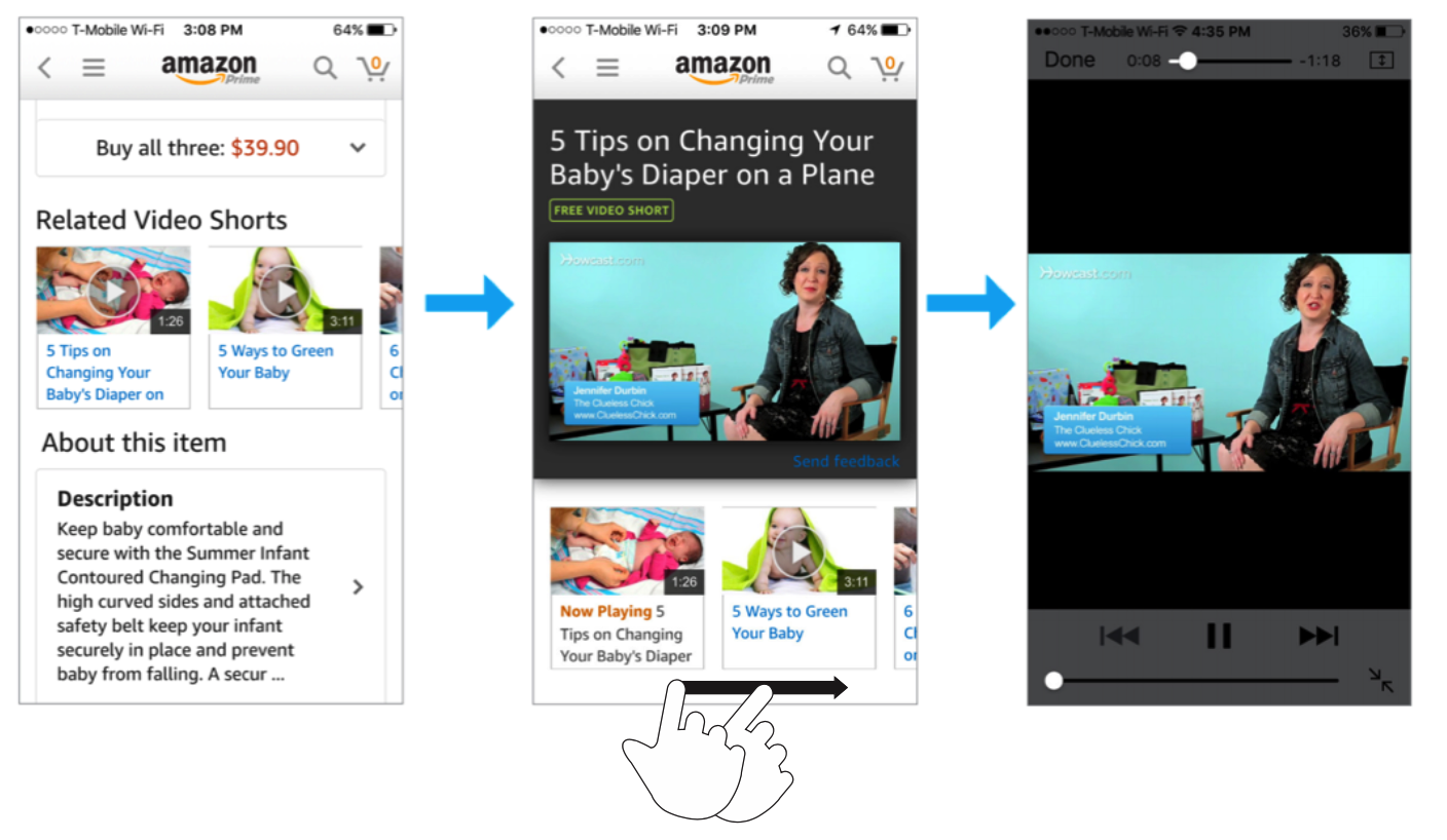
Customers seem not to engage watching videos within the lightbox control. The tendency is to watch one video and to leave the lightbox without watching the other related videos presented. Our hypothesis for the lack of engagement is based on the horizontal navigation for the related videos within the lightbox.
In the former lightbox experience, customers click through to a lightbox page that shows a single video player at the top and a horizontal carousel of video thumbnails below. The lack of visibility of the rest of the video options decreased the level of engagement. Also, the uncommon pattern used for this navigation influenced customers to leave the screen after watching a video.
I have intentionally omitted confidential data here.
Original mobile Lightbox experience
WHAT ELSE HAS BEEN TRIED?
The next step involves conducting a competitive analysis of other apps that allow users to watch videos via mobile. I look for positive and negative application behavior. I don’t want to reinvent the wheel, so analyzing features and interactions from other apps will help me to make better decisions during the ideation process.
I have analyzed the following apps based on user feedback: Facebook and Youtube.
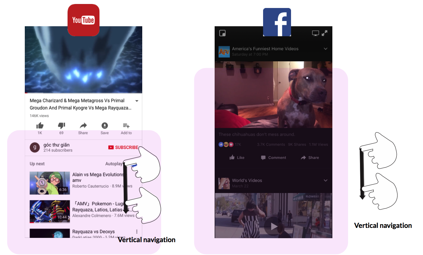
One word: Vertical navigation
The most common pattern used in other video platforms provide vertical navigation when browsing videos.
WHAT IS WANTED
Finally, an app definition statement will help me to identify what features I think users might like to have to make the viewing and navigation simpler and more efficient.
Features
- Video duration.
- Provider.
- Provider badge.
- Customer review label.
- Timestamp.
- Feedback.
Detailed Design
Communicating Design
Amazon upholds infamously high standards for the work it produces both externally for customers and internally for team members to consume.
This has created a culture which seeks to earn trust through accountability, diving deep into the details and inviting others to scrutinize work. Heavy documentation is the artifact of such a culture.
The size of this project and structured waterfall approach meant that I needed to have everything figured out before teams would commit to moving forward with the work. Many teams involved in the project needed to see it in a tangible document. This risk-averse mindset meant I created a lot of reference documentation that was widely distributed and a high overhead to maintain.
During the process of building the experience, I have to escalate UI issues even when doing so was extra work for the developers. I include the situation when I have to request the change in the experience of opening the report “Feedback” modal.
Developers committed the code allowing users to open the “Feedback” modal from right-to left even though the direction arrow of the icon pointed down. From the developer’s point of view, it was not a big deal that the modal was opening from the side rather than down. However, from a UX designer perspective, it was the wrong experience.
Dialoguing with the team and exposing the reasons why it was so important for the user to make the change allowed me to prove and earn their trust regarding my knowledge in the User Experience field. As a result, currently I am always prompted to deliver feedback in any situation that requires interaction with users. Due to making this good decision I have built a positive working relationship with the team.
GENERATE IDEAS CONSTANTLY
For each feature phase, I went through cycles of requirements, consensus, approvals, detailed specs and handoffs.
My process involved sketching and white‐boarding concepts and flows with my PM partner and then translating these directly into hi‐fidelity design comps. Since I was working with many existing design patterns, it was relatively easy to move straight into hi‐fidelity designs.
IDEATE
In this part of the process, I am immersing myself in the world for which I am designing. I generate ideas constantly. As a matter of fact, I have been keeping a notebook with me because you never know when you are going to be inspired.
I have been sketching my vague ideas to think through them more clearly. I love sketching because it forces me to visualize how things come together.
After a few sketches and quick wireframing, I felt ready to switch from paper and pencil to Sketch. Sketch will help me to create the flow and I will Include only what is required to render the intended purpose or concept that I am planning to deliver.
The following Wireframes are versions prior starting the prototype phase.
“ Prototypes are about testing ideas.”
PROTOTYPE
Mobile Prototyping with Axure RP
Axure proved to be the best tool of choice for prototyping. Because of tight timelines, I chose to develop a high‐fidelity prototype which had both benefits and drawbacks.
On a positive note, the prototype was a powerful tool in creating transparency in the design process. My what you see is what you get approach strengthened my relationship with leadership and allowed me to gain feedback and approval from both my stakeholders and development team early on.
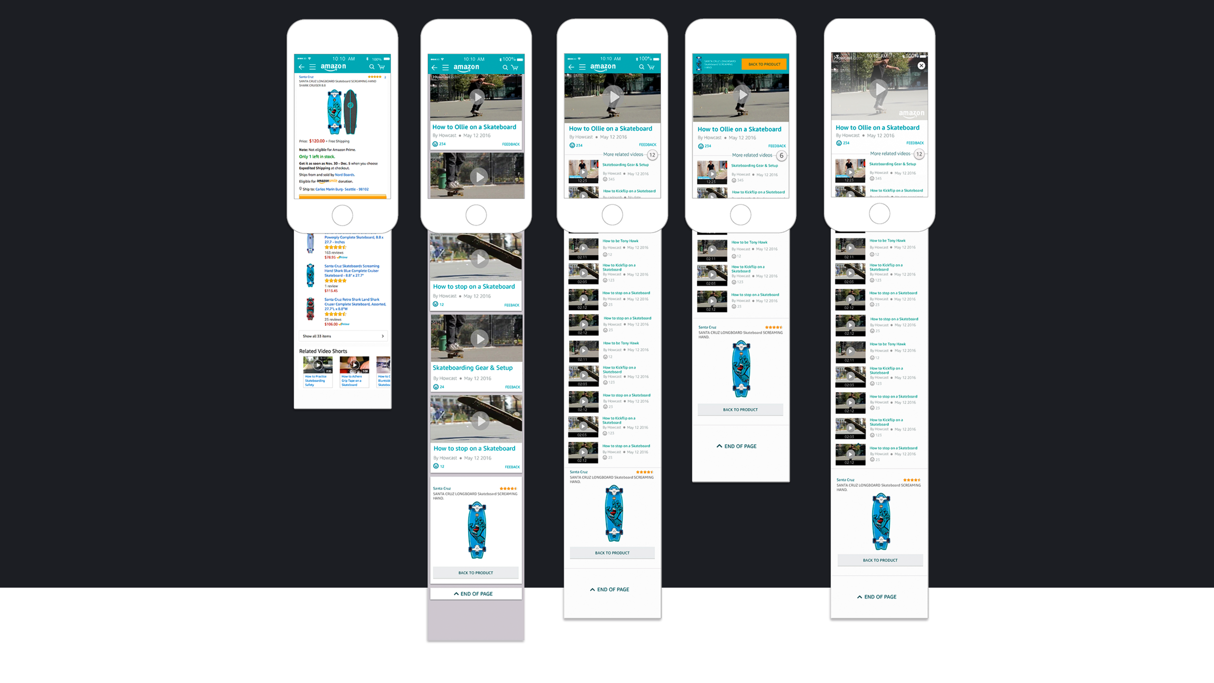
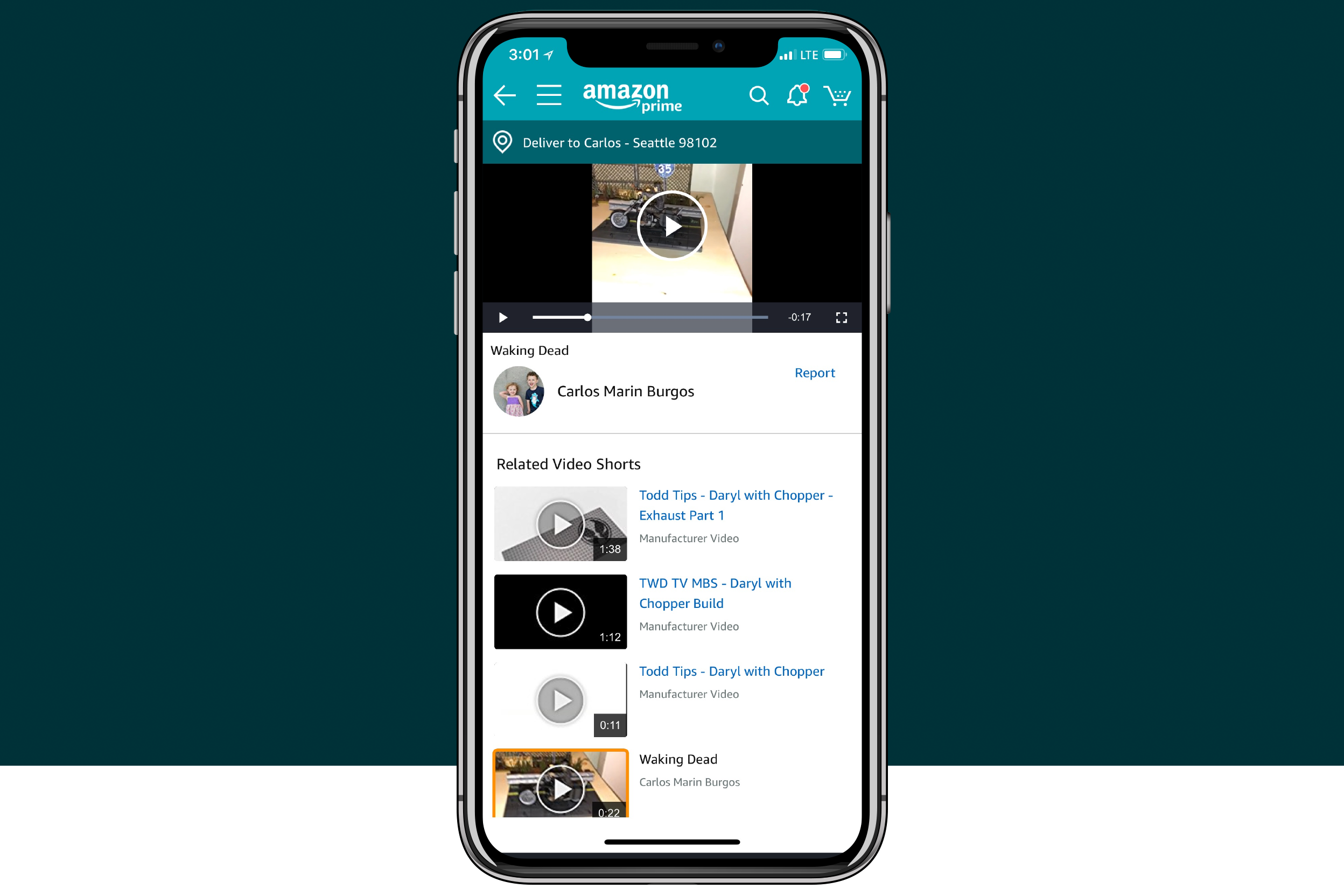
UI X-Ray
As mentioned before, the goal of this project was to engage users to watch videos related to products. Thus, based on the user feedback, designing a player that stays in the top position of the screen while playing consisted of a requirement for the experience. Many participants mentioned the desire of being able to watch a video, without any interruption, while scrolling up and down within the screen.
Users can view the video in full screen tapping on the video player. Another design requirement states that the video auto-plays on page load. The mute mode is on by default.
Another characteristic of the experience consists of making sure that users have a clear idea of what video is playing at the time. As a result, adding a border with a determinate color helps customers to identify the current video playing.
Feedback regarding what metadata to show to support the video thumbnail was necessary for the final delivery.
METADATA
- Video title.
- Provider.
- Duration.
- Number of views.
- Timestamp.
- Provider badge.
EVALUATE
From the beginning of the project, I was focusing my work trying to understand the necessities of our customers. We conducted several Guerrilla tests to gather data regarding how users navigate and search for videos. The feedback obtained helped us decide between the different concepts that I was proposing.
We tested the new UI with five participants, looking for usability problems. We also talked to participants about what they would use video results for, looking for what kind of functionality is needed to solve the users’ real problems.
Feedback: “I like to watch a video while I can navigate on the screen.”
User Insights
MULTITASK
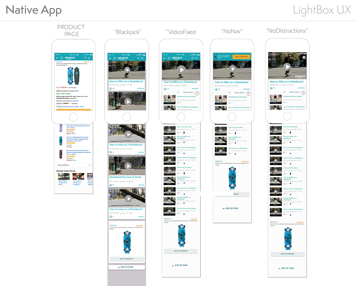
"Card" versus "Fixed"
The two final concepts, based on video navigation, were the "Card" design and the "Fixed" design.
Four of the five participants indicated the preference of navigate through the videos while watching the video located at the top of the screen. This model allows users to be able to watch any selected video while the vertical navigation let them browse other media content without interrupting the viewing experience.
Based on the user feedback obtained during the sessions, I proposed to leadership to move forward with the "Fixed" model.
Card
With this test, I replaced the current lightbox with a vertically-scrolling list of video cards.
When the lightbox first loads, for each item, I show a video card with a thumbnail image (inline autoplay).
When a user clicks on a thumbnail image, the image swaps for the video player instance, and then let the player take over and bring the user into full screen mode.
In order to obtain more accurate feedback from users, I uploaded the Axure RP files to a server. As a result, I was able to access the prototype from a mobile device providing a very realistic experience to the participants when testing.

The Result
Introducing the New Experience
New design shipped in June 2017
The Impact
Positive results and much more to do
The redesign of the lightbox on iOS and Android has had a positive impact on the video viewing experience. The video engaging rate has been significantly increased which means customers continue to watch videos on mobile.
I have intentionally omitted confidential data here.
Launching Is Only The Beginning
The design process for the mobile lightbox continues evolving. Many missing features were eliminated from the original design proposal due to time and technical constraints. Our team was quick to jump to the perceivably easy solution to design a new mobile lightbox.
I fought against this proposal, based on the rationale that eliminating some important features would affect the levels of engagement.
One feature that I thought it was mandatory for users consisted of being able to provide and browse video feedback. What is the point of presenting a variety of videos without a reference to the quality of the videos? Remember that the whole goal of this project consists of providing guidance when purchasing an item via videos. How can users know what videos are helpful?
At the time of launch, I had difficulty accepting the reality of this new experience, because I knew where all the dead bodies were hidden. I knew which critical features were missing.
My dissatisfaction is not a case of perfectionism, but rather an insistence on quality. Quality that should never be compromised, even in the first version of a product. Quality is the responsibility of an entire organization and I have learned that awesome experiences are only possible if the whole team truly shares the same values and aspirations.
Jeff Bezos’ famous saying at Amazon is that “it’s still day‐one”. For Video Shopping Experience, this could not be truer.